My target markets that I chose to base my design around are men between the ages of 20-30 years old. They are business men, which during the week have a busy, a big schedule. As business man they go through a lot of paper usage, so he is aware of environmental issues, due to being in the corporate world. He is on a go to go basis, time and organisation is the key, so having simple tasks are best when it comes to additional errands apart for work. Apart from that he still has a healthy life, where he stays fit and on weekends his is relaxed in front of a bqq with a bunch of mates. So you can define his home as clean, simplistic with a balanced lifestyle, as is bombarded with a lot of business during the week.
In terms of objects, they see the values an object in performance and function more than an aesthetical please. But on the other hand they have money, who’s aren’t the type to spend for value but purpose. So when it came to choosing from the sheet material of aluminium, mild steel, acrylic and polypropylene, I chose to use acrylic material.
The reasons for my choice were due to the possibilities of moulding and bending, as well as the range of colour and textures acrylic is formed in. When using acrylic sheeting, I wanted to try to show the limitations and qualities of the material. As I researched the properties of materials, being hard, smooth, rigid, brittle, resistance to weather, great for outdoor use, but highly brittle.
Looking at the brittleness and rigidness of the material, I chose to design a recycling bin, as the purpose of the bin doesn’t involve it to hold a lot of weight. As well as this sheet material, come under the heading “plastic” which is seen as not a high level of value, which again suits the idea of the bin, because a bin isn’t valued as an expensive product similar to the value of the plastic. Therefore the choice of material suits the choice of designing a recycling bin, which in term will then satisfy the properties of eth material, as this paper bin will not require supporting a lot of weight, due to its rigidness.
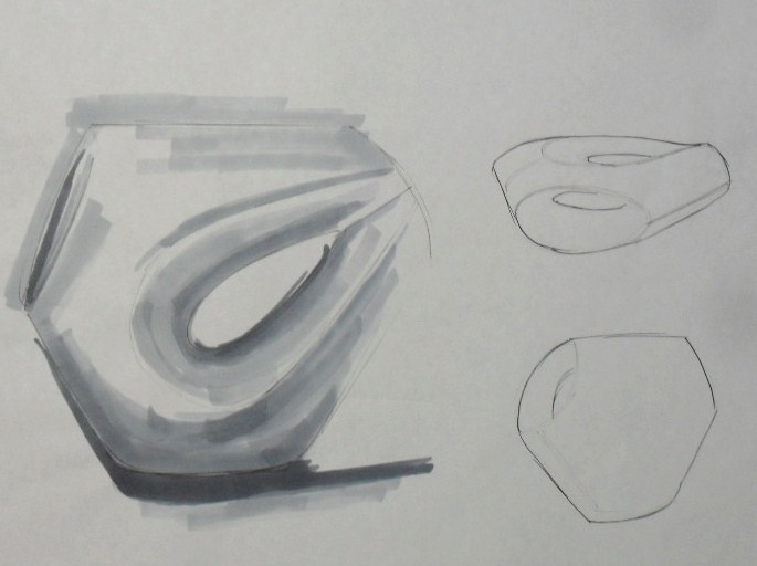
When it came to design the form of the recycling bin, I wanted something simple and basic, but at the same time, projecting a systematic way to hold paper, still showing the characteristics of the material. The recycling bin was formed from a flat sheet of material, when bending and forming would be required to shape the bin, so through my design I avoided the use of fasteners. Having the idea of the bin come together by overlapping each other created the sense of a completed shape. The form of the bin is slightly angles on either side, as I wanted to differentiation my design from the existing cylindrical forms.
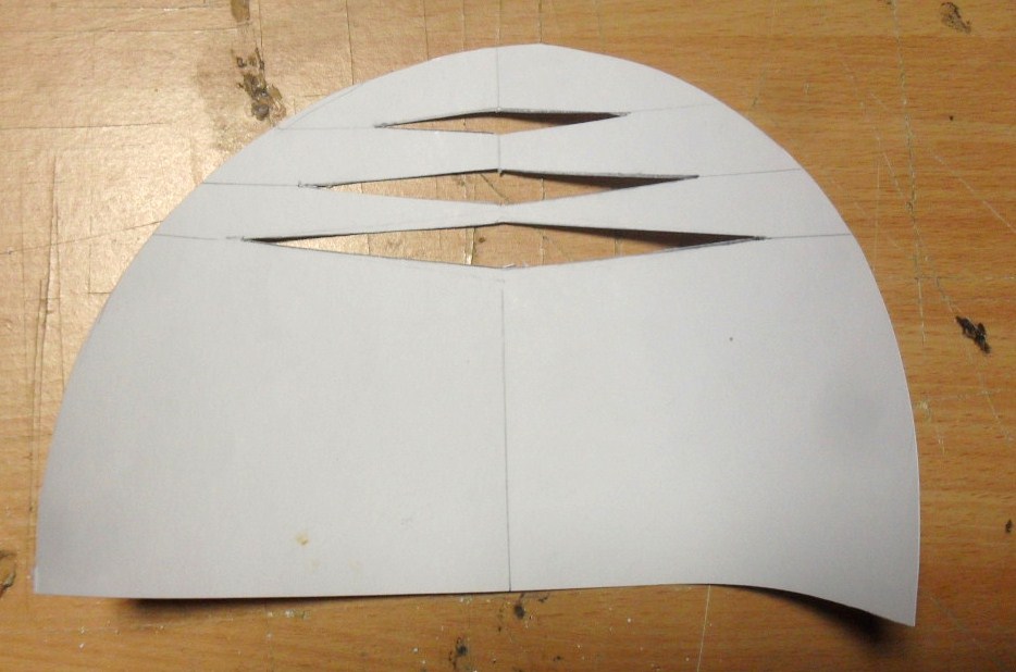
So I first decided that I wanted the form to slight have a curve shape, but when it come to talking to manufacturers, to see if my recycling bin was possible to be made, I found out that it was, but through the limited time that we had in producing my design it wouldn’t be possible, in terms of time. So there had to be some compromising in form to my design. In order to still have an enclosed form, I had to change the form slightly to be more squarish, as the perfect curves wouldn’t be possible. Instead of it being heated in an oven, particular parts of the plastic was heated on a strip heater, to get as close as possible to the design.
In my opinion the way the manufactured the design of the bin, to be more squish, has enhanced the design of the bin, but more the function of the bin. As the shape of the bin has invisible queues, for the way the target market can place the paper in the bin. The paper is meant to be placed vertical, across the large dimensions of the bin. It allows the papers to place neatly across the bin so the paper can be reused and printed with. If I kept my design, with the curves, when there is a lot paper piled together, it will eventually stay in a curve formation, which then will be hard to reuse, in a printer. In the end the form of the bin fit in with the contemporary, simple lifestyle of my target market, as well as enhancing his healthily and conscious lifestyle of the environment.
However through adding detail to the simplistic form, it enhanced the complexity of the design, but at the sometime, these details were for purpose. I decided to cut horizontal slights in the plastic as a form of grip. I added rounded and curved edges as my plastic is very brittle and rigid, so I was trying to reduce the chance of breakage.
These minimal details give a different perspective to the design of eth bin, rather than having a plain form. This was enhanced by the choice of colours that this bin could be made of. The reason why I chose black was as it was a neutral colour, which will most likely fit in with my target markets home, as well as having a bold colour will make it easier for my target market to recognise rather than need to search for the bin, in order to use it. Therefore this bin can come in other colours, of blue, green, grey, cream, white, which are bold so target markets busy schedule isn’t interrupted by looking for the paper bin. Having this material with a glossy finish also references back to my target markets glossy clean table tops.
When placing this recycling bin in my target markets office, it will stand out due to the bold chose of colour as well as unusual shape of a bin, which I was trying to achieve. In designing a recycling bin for the purpose of my target market as well as influencing the idea of recycling, my design is purposeful, from its shape, through to its intended use.


 Sketches of IDEAS B: