Friday, April 22, 2011

Australian Design Awards - Comments and Improvements

Sport & Leisure: Knog Tools


Designer
Catalyst Design Group

Client/Manufacturer
Knog Pty Ltd

Introduction:

The Knog tools are compact and connectable tools that can be used for various jobs. They are multifunctional in terms of the tools imbedded with neo-magnets for stacking and connecting ranges of tool heads to handles, therefore being interchangeable. They range from a 7, 12, 20 function tool, an adjustable shifter and pliers with the range of covers from hex keys to a 15mm wrench. The main structures of the tools are made out of anodized aluminium with harden steel still being compactable. It can also be used for opening a bottle.


Analysis:

PROS:
  • Pocket-size.
  • Neo-magnets for stacking multiple tools.
  • Opens your beer.
  • extremely compact.
  • easily carried outside environments.
  • hardened steel.
  • magnetic.
  • all tools are modular and interchangeable.
  • Tough high quality cold-forged tool.
  • Nickel plated steel chassis for robust construction.
  • the range covers everything from hex keys to a 15mm wrench.
  • anodized aluminium top plate.
  • rubber logo insert.
  • more fashion savvy individuals.
  • UNIQUE.
  • a range of anodized finishes to suit your style.
  • Clever ‘transformer-like’ unfolding design.
  • playful human interaction component.
  • rust proof, as aluminium.
  • Only tools required can be taken with you, therefore less weight to carry.

CONS:
  • The magnets might wear off over time and therefore the sturdiness of the tools isn’t up to their high standard and maximum force use.
  • Might collapse or fall apart from the magnetic connections when being used on tough jobs.
  • Can be easily lost or misplaced in places or tool box, as smaller and a compactable item.
  • Handles are tough on human form, when used with a lot of force.
  • Only can be used for smaller jobs.
  • Large enough to satisfy ergonomic form.
IDEAS A:

These ideas addresses the issues of strin on ones hand when force is applied on tool, projecting pain into the hands of the user as the edges of the metal are hard against the edges of the handles.

Examples: Tools Handles
    
    Sketches of Ideas A:
    IDEAS B:
    These ideas addresses the issues of the magnets in the design of the tools, as magnets strength wears off over time as well as it might not be as tough for jobs that require large force placed on the tool.
    Examples: Existing fasteners
Sketches of IDEAS B:
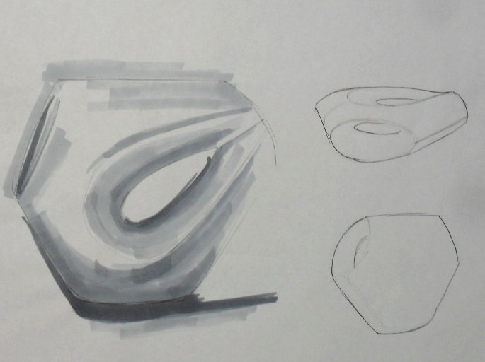


IDEAS C:

These ideas address the issues of strain placed on hands when using the tool. These ideas require minium change to existing idea, just change in shape to minimise pain on hand.

Sketches of IDEAS C:


Friday, April 15, 2011

Project Two: Southern Cross Package Design Awards - Hero Shot

Most tinplate packaging came in the basic 3D cylindrical forms. However the design was focused in exploring the limitations of tinplate, by still having a 3d form, by adding curves, embossing, engraving and funnel forms. Firstly steps were taken to initiate an understanding of tinplate, meaning it is easy to melt/mould/recycle, soft, highly corrosion and fatigue –resistant and non-toxic. Knowing that tinplate is a combination of steel and tin, it acquires these properties in order to use safely and further explore different shapes of packaging.

So my final packaging would be made out of tinplate and acrylic material. For the purpose of the mock up, icreated my packaging out of wood.


Project Two: Southern Cross Package Design Awards - Ergonomics of Packageing

Ergonomics:


With the packaging, the edges of the tinplate have been curved. The most important curve of the design is the base curve were the radius of the curve fixes ergonomically well within ones hand. In addition to this there is a groove 16o indent in for the window, where the target market can place their thumb in that section of the package as a grip, so it will not slip out of their hand.

Project Two: Southern Cross Package Design Awards - Context of Use

My packaging can be used as a gift or for personal desire, when boought from retailer.

Project Two: Southern Cross Package Design Awards - Packaging On Shelf

The packaging is targeted to retailers, of higher selling goods meaning, such stores as boutiques for nuts, David Jones or Myers etc. So the image of the packaging reflects the value and quality of products sold in these shops and therefore the product suits the store, with a bold statement from shelf appeal.


The packaging will sit on the shelf firmly next to each other, but being less in width and more in height, the containers are able to stack horizontally closely together, meaning there can be more stocked on one shelf. However considering the store the items are placed, these premium products aren’t designed to stack one on top of each other, as it isn’t a wholesale industry, such as Coles, Woolworth or Aldie.

Project Two: Southern Cross Package Design Awards - Premium Packaging

Aesthetics:


Through exploring existing products of both nut packaging and premium designs, it had enabled the comparison and understanding of the differences in packaging. It had drawn a path of where the product is situated, the MIDDLE.

Project Two: Southern Cross Package Design Awards - Plans

PLAN 1:

Quantity:
The packaging was targeted for use between two people, or a gift to one or another. This container isn’t a family serving packaging, due to the target market presented above. The amount required to fit within the packaging was done by the exploration of supermarkets and retail stores, in which the quantity ranged between 150g – 225g, due to them being packaged for different purposes cooking, serving or eating. So a quantity was chosen within the range, 200grams. John Irwin was contacted who mentioned that this brief don’t specify, but he suggested quantities between 500g – 750g which is far too much for two people as a serving.


PLAN 2:
Transportation/Shelving/Purchasing/Use:


When transported from factory to retail shops, the size of the box has to be no bigger than 470 x 450 x 325mm each, as when employees have to stock shelfs the dispersing of the cardboard boxes from the trolley to the aisles must not be heavier than 20kg for the safety of person lifting the boxes. This was calculated: (knowing there are 48 packaging in one box)

(1) The amount of weight of the nuts and the packaging:
=320g

(2) The weight of the distribution box:
=15.36kg


Project Two: Southern Cross Package Design Awards - Development of Packaging

Shape:

The packaging is designed for dispensing macadamia nuts, which are one of the premium nuts sold. Knowing that Macadamia nuts are Australian made, the design hinted this with the reasons of using a hexagonal form. Having defined straight edges with slight curve, it references to the logo of Australian companies.

The shape was adapted further by placing curved edges on two sides of the packaging as an indication and influence to one’s eyes to observe and follow through to an acrylic window where the nuts are displayed.


I decided to go with the rich maroon colour(royal, superior), and the name Signiture. I was focused in looking for curvature fonts to reflect Signiture. The font was Lamina Scott SCH . As well as Constantia font was used for “Macadamia Nuts”, as it was intended to stand out from the company name, completely opposite to curves.
 
The design also involved a window in the centre of the packaging to reassure the customers that “what you see is what you get”.  Originally the design of the window was a rain drop shape, however when looking at the design as a whole, the shape of the window didn’t have any connection with the packaging.

It was found that when people look at products and other forms of design, they look at objects geometrically, and try to relate or reference the shape to something they have experienced or seen. Therefore it was required to explore other shapes, in order for the consumer to relate to the object as a superior, premium packaging for nuts. So i changed to a shape of a macadamia nut to have that connection to the packaging.


  .........................................>
Having the edges of the packaging straight, to allow the user to identify the product in way that reminds them of one person standing up straight, with chest out, back straight and head held high, and hand on hip which links back to the product being superior, proud to be on the shelf. It allows it to attract customers, compared to the cylindrical products already on the market. Being bold in form tolerates the attention that it needs for
customer’s as a premium product.

Project Two: Southern Cross Package Design Awards - Development of Shape

When looking at brief, one of the requirements were "The package may be of any shape, however, transport ...... should be taken into account. ".

As my final concept, it is in a shape of a rain drop with straight edges, meaning having uneven sides. This proposed a problem, in terms of the requirements as the shape will  not be the most practiable shape, when it comes to packaging it for distribution to retailers.


A Rain drop shape


The edges of shape were changed to be even, so
it turned out to be a hexagonal shape.


............................>


Project Two: Southern Cross Package Design Awards - FINAL CONCEPT

Concept One was the FINAL CONCEPT for this brief. This packaging was designed for the purpose of macadamia nuts.

I felt that choosing this style of packaging was premium quality, bold, unique and different from other nut packaging out on retail. As well as it fitted the brief. For further explaination read my RATIONALE. (link)
Rationale


Project Two: Southern Cross Package Design Awards - Three Concepts

After developing who my packaging will be focused on, it drew a path to the development of three concepts. Whilst developing the three concepts, i was generating packaging names, the best ones that i came up with were:

- PLATINUM
- VINTAGE
- SIGNITURE

Concept ONE:


Concept TWO:

Concept THREE:


Project Two: Southern Cross Package Design Awards - Target Market

The market that was to be focused on the nut packaging was young middle age socialites between the ages of 30 – 40 years. These people work in business and have for a longer period of time compared to younger people just starting out. Meaning they have earned and saved money which in turn have gained a place in society. So it enables them to have a high end lifestyle, with luxurious choices, such as this premium nut packaging product. They have seen the value and quality of a product, as they have experienced a diverse range of products in their life time, so essentially they know what is best, looks and tastes like.

Project Two: Southern Cross Package Design Awards

Our next project involved entering the Southern Cross Package Design Awards. This competition consisted of choosing one of the 9 briefs and design packaging within teh constrants of the brief.

I chose Brief D – Nuts or Confectionery in Tin, which was to design a single unit package, manufactured predominately from tinplate, for a premium nut or confectionery product. The product is to be sold by a premium retailer to create awareness and increase sales. The packaging could be any shape, but most importantly focusing on transport and in particular shelf display. The packaging has to have strong grapgics to appeal to the target market. It must be eye-catching, attractive and have strong visual impact.

There are mandatory requirements involved within this breif.